I’ve been focusing on regression to tails for while now. I came across an article, The dangerous disregard for fat tails in quantitative finance. Finding the mean and the standard deviation is hard. Thick tail distributions are unlike normal distributions. Normal distributions are usually assumed and underly linear regression.
I’ve taken a data view, rather than a dataset view. From that perspective, I could see that skewed normals happen when the dataset is too small to have achieved normality. When we assert the existence of a random variable, a Dirac function produces a vertical line to infinity. Then, we sample a sequence of values for that random variable. As a line, there is no probability, but as we sample the line becomes an interval, so we begin to have a distribution and probabilities. That distribution has a peak at some height. As the sample size increases, the height of distribution decreases. Once the data actually achieves normality, the height of the distribution falls, typically, to a value of 0.4.
The next figure stood out. The height of the distribution is 0.6. The distribution has already achieved normality. It is not a distribution on its way to achieving normality. The figure is based on a standard normal. Then, three thick-tailed distributions are overlaid on that standard normal. The thick-tail distributions have heights higher than a standard normal.

A straight line sits at the peak of the standard normal. The shape of the standard normal is labeled D. The three thick-tail distributions are labeled A, B, and C. The peak for distribution A is light blue; B is green; C is pink. The upper black dot is where thick-tailed distributions are thinner than the standard normal. Where they are thinner, they are inside the standard normal compressing the probability mass. The lower black dot is where the tails of the thick-tailed distributions are fatter than the standard normal and get back outside the standard normal.
The red arrows show how the probability mass moves. The probability mass inside one standard deviation from the mean increases from 68 percent to something between 75 to 90 percent.
The sampling process begins with the first sample. The distribution is in hyperbolic space. The process continues. Eventually, the sample achieves normality. The mean, median, and mode converge when normality is achieved. The distribution is in Euclidean space. As the sampling process continues, the standard deviation increases and the distribution is in spherical space. We, however, assume Euclidean space throughout.
I drew the next figure to illustrate the first paragraph on the page following the figure in the article that I used as the basis or the first figure in this post.

Each circle is one standard deviation larger than the circle inside it. The gold denotes the area three standard deviations from the mean or the extent of the standard normal. The space here is Euclidean. The Markov chain connects to linked events, black dots, that cascade into catastrophe.
At six standard deviations, the light blue circle is representative of an area out in the thick tail. This area would be elliptic, rather than circular. A lone single event, black dot, can cause a catastrophe. The space here is spherical.
The labels a1, a2, a3, and a4 refer back to the first figure where they inform us about the shoulders and tails of the thick-tailed distribution.
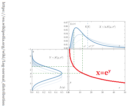
Log-normal distribution
The log-normal distribution is a thick-tailed distribution. IT is used as a first example. If your data is logarithmic, then this is the distribution to use. I’ve written about this distribution in the past. And I’ve posted this figure before. This time, the curve that the normal is reflected through is important.
A little Non-Euclidean Geometry
Teenagers get taught this stuff in high school these days. Expect to see more of it. While I was looking for regression to tail content, I came across Inversion in Circle on the Non-Euclidean Geometry blog. It mentions reflecting a triangle in a [straight] line with the next figure..

The orientation arrows change direction, otherwise, it is Euclidean on both sides of the straight line. That the line is straight is important. Curves change the results.

The orientation changes just like it did in the straight line case. The curve gives a particular result. The original triangle was Euclidean. The reflected triangle is hyperbolic. Well, that might take some calculations to prove that claim. The typical hyperbolic triangle is concave on all three sides. But, here A’B’ is convex. A spherical triangle is convex on all three sides. Draw straight lines for triangle A’B’C’. That is a Euclidean triangle. The straight line A’B’ is an interface between the hyperbolic and spherical spaces.
The normal distribution serves a purpose, and its triangle is thin or momentary. Before that distribution achieves normality the triangle was hyperbolic. One data point later, the distribution achieves normality and enters Euclidean space. Then, with the next data point, the distribution becomes spherical.
Next, I annotated the above figure.

I labelled the three spaces involved with the inversion. Pink represents the hyperbolic space. Grey represents the hyperbolic space. Blue represents spherical space.
The angles of a hyperbolic triangle sum to less than 180 degrees. The angles of a spherical triangle sum to more than 180 degrees. The purple numbers represent areas. The triangle would be spherical if A1+A2-A3>0, or hyperbolic if A1+A2-A3<0.
Space matters. When VCs do their analysis of discontinuous innovations, they do that analysis in Euclidean space. But, they are doing that analysis before normality is achieved, so their analysis understates the future proceeds. Given the understated numbers, they do not invest. That is a product management issue.
Other distributions
The first article that I cited in this post went on to compare a high variance Gaussian distribution and a Pareto distribution. The Gaussian distribution is stable.

The Pareto distribution converges to three different y values. I added triangles to represent the underlying logic of the associated each y-axis. It’s more important to see that the point of convergence is later in time each time the y-axis is changed.

Enjoy!
…
